UX Design Project
During this project, I approached an unfamiliar user group and user scenario (control of a light rig at a smaller concert) to design the interface (user flows & the look-and-feel) of a light rig control application. I want to show you this project cause it highlights how I approach and solve problems individually as well as my ability to work responsively across platforms. As a designer I thrive in a team environment where I can be an individual contributor and this project was a great opportunity for me to practice my UI skills and strengthen myself as an end-to-end designer.
This design was done by me in 2022.
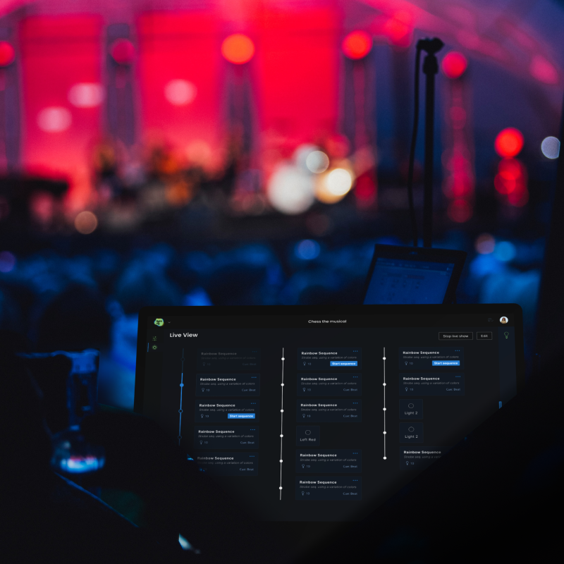
More or less advanced lighting rigs can be found at almost all concerts. These rigs are controlled using a tablet or desktop application. My task was to design an interface suited for the concert environment that could cater to both intermediate and expert users.
“Scope: Design a system that allows a light designer to prepare predetermined light sequences and control the lights on-to-go at a concert”
To conduct user research was outside the scope of this project. But, as a curious designer I wanted to get to know and understand the system I will be designing within. Luckily for me, Youtube is a great way to learn new things and I could make use of some knowledge I gained during another expert user project. Nowadays light designers often use complex 3D-visualisation tools to prepare a light show, which is very beneficial if they cannot enter the venue. However, when accessing the venue there is no need for visualizing the scene - it is right in front of you. So for this project I explored the idea of going back to basic and took inspiration from the balance between tactile and visual stimulus in a physical light control panel.
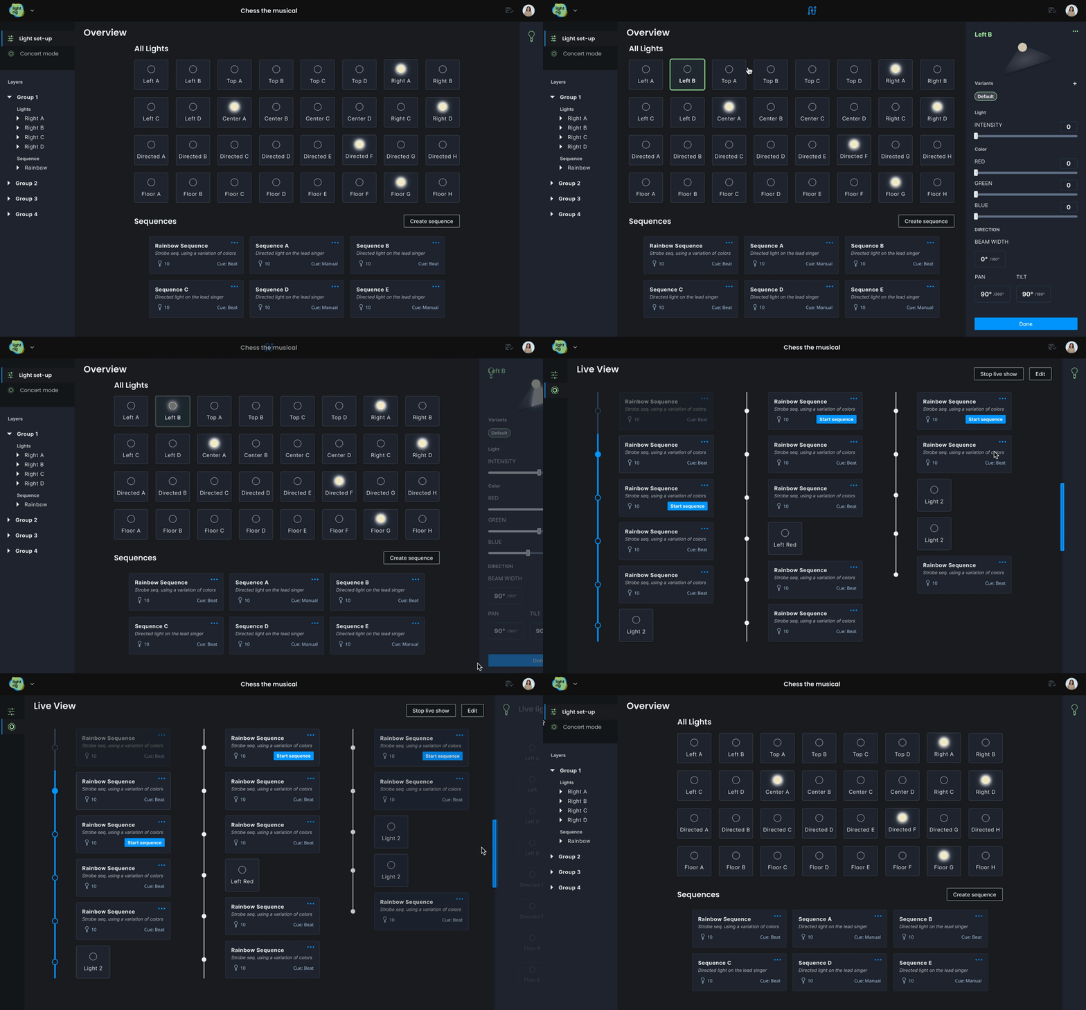
The scope provides two distinct use cases, one where the user needs to focus and make careful adjustment and one where the main attention should be on the live scene. This was empasised by initiating a main structure that supported both use cases. After some exploration, I found that the work flows was best supported by differentiating two modes through a tab structure. One that had a more sovereign posture and one with a more transient.
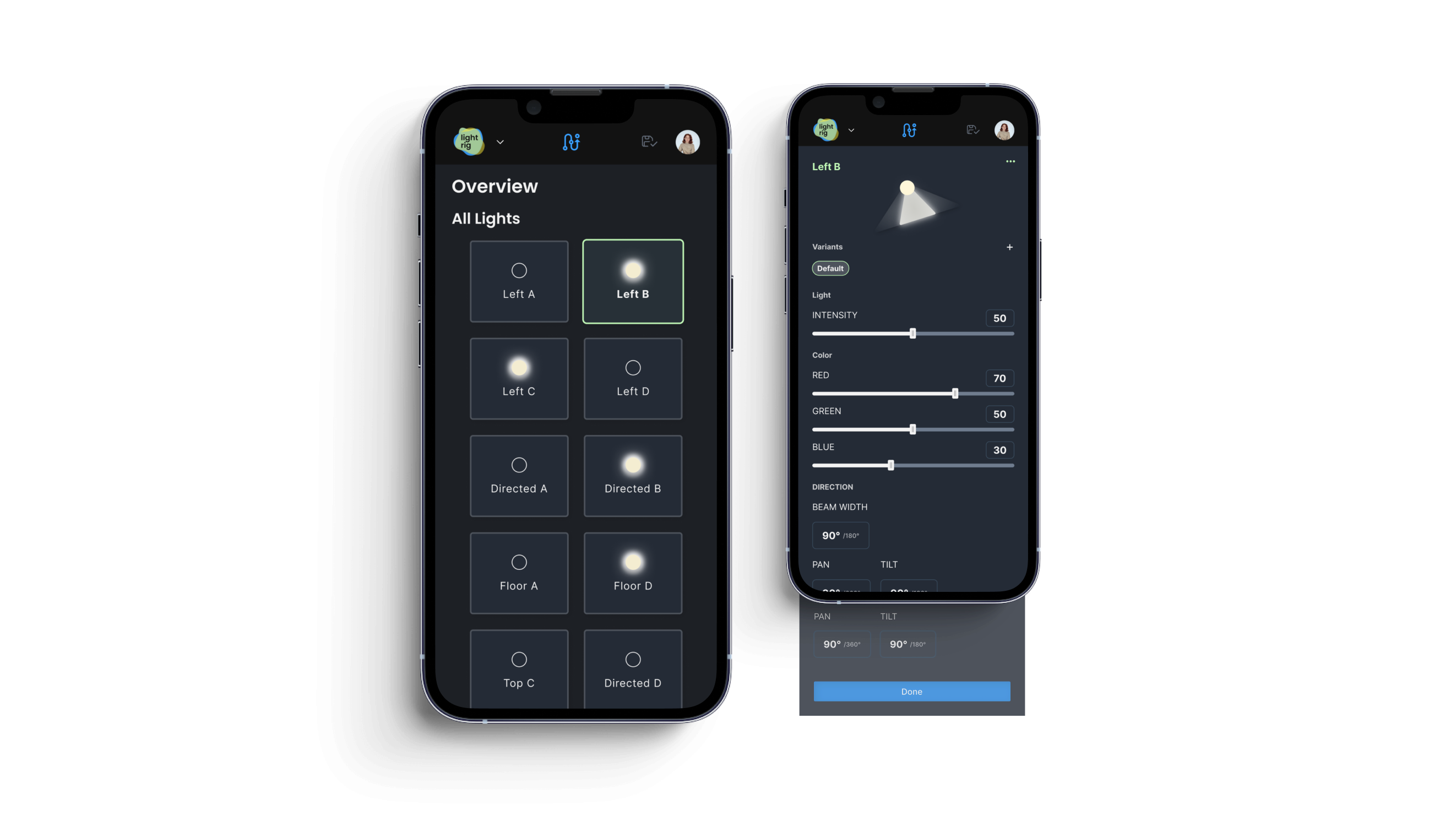
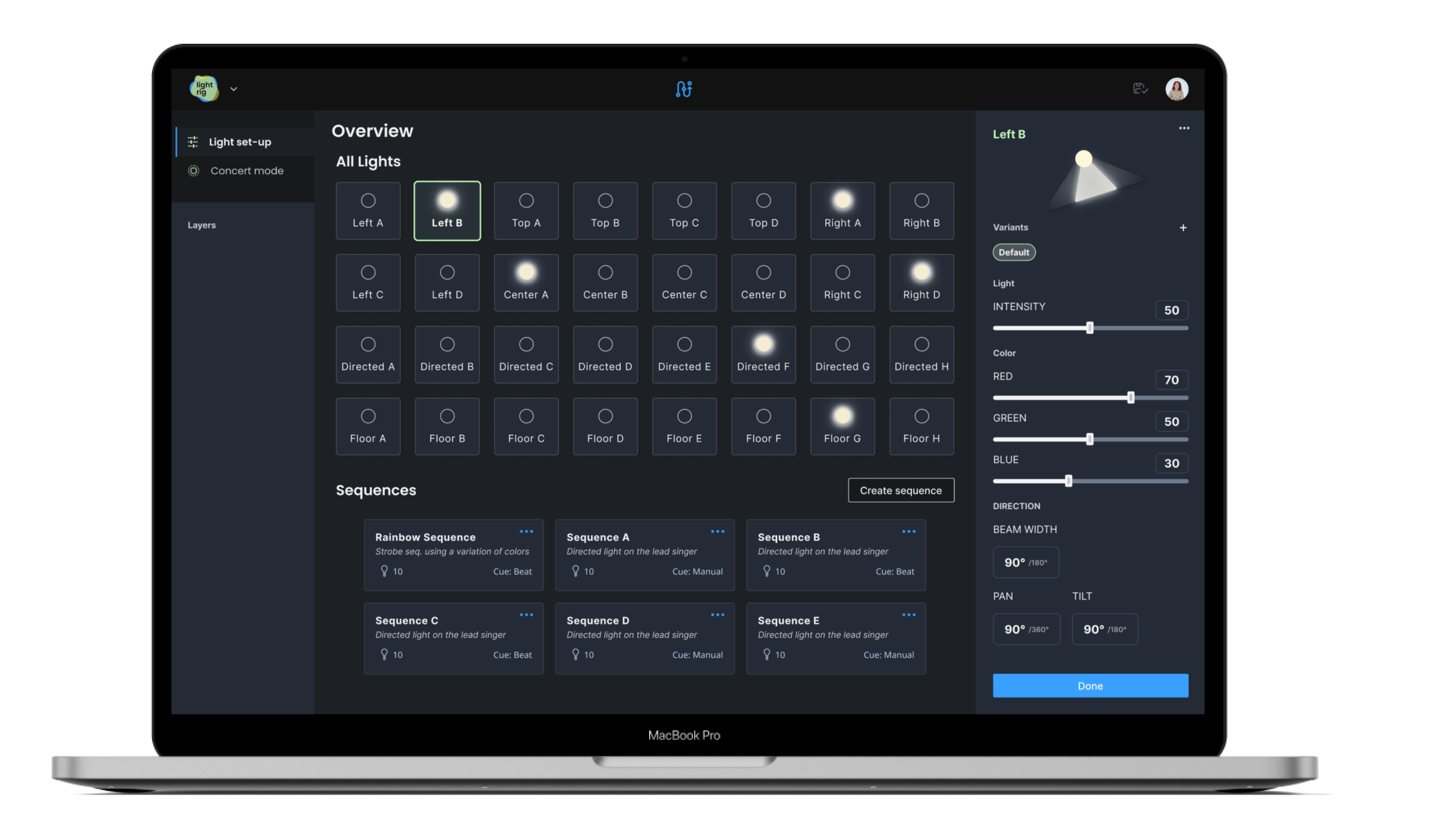
So, the system should allow adjustment of several light settings but at the same time provide an overview of the light status (on/off) to aid the mapping between the physical lamp and digital representation of one. During my exploration I wanted to ensure a responsive design. Primarily this interface is designed to be used on a desktop, however responsive design patterns also allow scalability of features. In this case using a tablet could allow the light designer to control lights from any angle in the concert venue. I found that applying a grid pattern best supported responsiveness between different window size and devices for the overview. For the light settings a panel placed to the right of the overview, and full-size for the limited space on a mobile worked best.
For products used in low light environment dark mode aid the eyes transition when shifting focus from the near environment to screen.
The light component will be used throughout the interface to represent individual light sources. With its two properties, light mode (on/off) and selected (selected/deselected), the light components are used to provide an overview of all existing lights, selecting what lights to manage (edit light settings, create a new variant, group lights or create a predetermined sequence).
Once a light, lights or group, is selected the light settings control panel will appear. The panel is used for controlling several attributes of the light, but you can also create variants if you want to use the same light in different modes throughout the concert.
For creating a light sequence I used a common pattern from various creative tools - an interactive timeline (using common UX patterns aid the learnability of an interface). Once a sequence is created it will be represented as a card throughout the interface. The user can interact with the card e.g. to play or edit.
By making use of the light and sequence components, a linear timeline approach was established for the concert live mode. The aim is to provide a design that can aid the user to manage and keeping track of predetermined sequences.
While wrapping up this project I am reflecting on what has been the main challenges and my learnings during the process. Amongst a few I am leaning towards: How do you best organize your design files? There are many answers to this, but I have found one aspect, to separate working areas by using different pages within my Figma design file, useful. It provides an opportunity to differentiate “creative brainstorm” (yes, this is most often my most unstructured bit) from “ready-to-review ideas’. In addition to building a component library once a design on an element was set ensured consistency in my design and efficiency in my work. I will (and have already) continue to use this approach since it will give me a head start in the process and allow me to evolve my design skills even further!